What NASA’s Artemis Dashboard Can Teach Us About SOC Operations
By Glenn Ambler
Like many people, I followed NASA’s Artemis mission with fascination. Watching humans return to deep-space exploration for the first time in over 50 years was inspiring.
But the SOC analyst in me couldn’t help looking past the rocket and focusing on something else entirely: the dashboard.
Great dashboards are surprisingly rare.
Too often, SOC dashboards become collections of charts, maps and metrics that look impressive but don’t actually help people make decisions (pew-pew maps !). A dashboard should have a clear purpose. It should inform the viewer and prompt action. Done well, even someone simply walking past your video wall can become an informal extension of your security operations team.
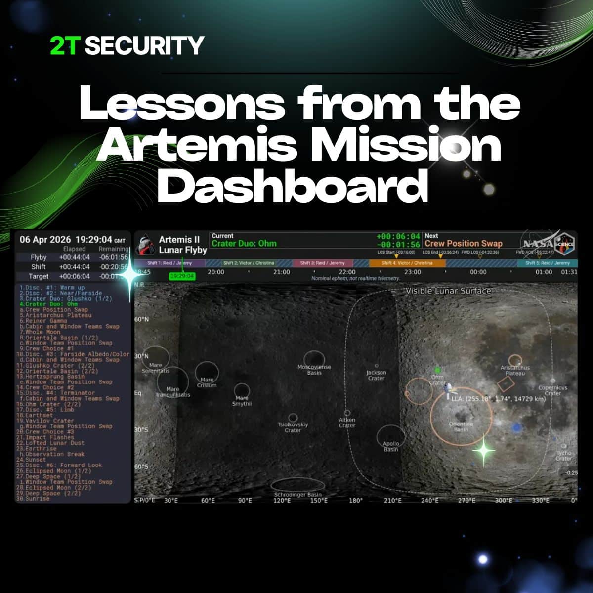
Looking at the Artemis dashboard, there are some remarkably useful design principles.
Mission Control has never been about displaying as much information as possible. It’s about helping the right people understand the state of the mission, anticipate what comes next and make good decisions under pressure.
That’s exactly what a Security Operations Centre should do.
The best SOC dashboards aren’t reporting tools. They’re operational tools.
Tasking: What Needs to be Done?

The left-hand side focuses on tasking.
What needs to happen? In what order? What’s next?
You can guarantee an enormous amount of thought went into selecting and prioritising those activities. In space, confusion costs time, introduces risk and potentially jeopardises the mission.
The same applies in a SOC.
Your ticket queue should be prioritised in a way that works for your business. Analysts shouldn’t have to guess what matters most. The system should guide them.
Current Priority: What Matters Right Now?
At the very top of the display sits the current priority and what’s coming next, shown prominently so everyone understands exactly what’s happening.
SOCs can benefit enormously from adopting the same principle.
Are you handling a critical incident? Are you in business-as-usual triage? Is there a major business event that requires additional support?
Simple visual indicators such as RAG status can instantly communicate the operational picture.
Timeline: Who Is Doing What and When?
The Artemis dashboard also clearly presents timelines, responsibilities and critical events.
Everyone knows who is accountable and when key milestones occur.
For security operations, this translates nicely into shift leadership and operational coordination.
Who is leading the current shift? Which specialists are engaged? Are there major business processes occurring today? If you’re operating globally, when do your colleagues in other regions start and finish their day?
Context matters. Security incidents don’t happen in isolation.
The Big Picture: Situational Awareness
The central display isn’t trying to answer every question. It’s answering the questions that matter most at that moment.
- Are we on plan?
- Are we drifting away from expected outcomes?
- Where should attention be focused next?
Many SOC dashboards attempt to display everything at once – thousands of alerts, dozens of widgets and endless graphs. Ironically, that often reduces situational awareness rather than improving it.
Good operational visualisation reduces cognitive load. It gives analysts confidence that they understand the current state of the environment and where they should focus next.
The best dashboards don’t simply report information. They create shared understanding.
Dashboards Should Drive Behaviour
One of the easiest traps when designing SOC dashboards is measuring what can be measured rather than what helps people make decisions.
Dashboard design starts with questions, not charts.
- What decisions does an analyst need to make in the next five minutes?
- What information does a shift lead need to coordinate the team?
- What does senior management need to understand about operational risk?
If a visual doesn’t influence behaviour or support a decision, it’s just noise.
One More Lesson: Pick a Time Zone and Stick to It
One thing that particularly pleased me was that the Artemis dashboard operates in GMT/UTC.
The scientific community has worked this way for years.
Having experienced the pain of managing systems hosted in Australia with 10,000 users in the UK, while navigating multiple daylight-saving changes each year, I can say with confidence: your future self will thank you.
Choose a standard time zone and stick with it.
Personally, I’m biased towards UTC.
Never Forget the Human Element
Finally, the Artemis dashboard includes dedicated time for team changes and “crew choices”.
That feels incredibly important.
Even on a mission to the Moon, NASA recognises that people need time for handovers, breaks and moments of autonomy.
security Operations is ultimately a human discipline.
AI can triage alerts.
Automation can enrich data. Detection can improve visibility. But judgment still belongs to people.
Good dashboards respect that by presenting information in a way that supports human decision-making rather than overwhelming it.
We need structured shift changes. We need time to think. We need opportunities to make our own decisions.
Quite often, that’s where the magic happens.
Whether you’re orbiting the Moon or defending critical systems, success rarely comes down to having more data.
It comes down to giving people the right information, at the right time, in a way that enables action.
For more information on the Artemis 2 mission, visit the NASA website:
At 2T Security, we’ve always believed that effective Security Operations isn’t about collecting more telemetry or building bigger dashboards. It’s about giving analysts the information they need to make confident decisions when it matters most.
Whether we’re designing Security Operations Centres, developing operational visualisations or integrating AI into analyst workflows, the objective is always the same: reduce complexity, improve situational awareness and enable better decisions.
NASA’s Artemis dashboard is a reminder that the principles of good operations don’t change, whether you’re flying a spacecraft to the Moon or protecting critical national infrastructure.
Great dashboards don’t simply display information.
They create shared understanding, support better decisions and help teams succeed under pressure.
Related reading
As AI becomes an increasingly important part of modern Security Operations, discover why Continuous VulnOps is changing the way organisations think about vulnerability management and operational resilience.
Continuous VulnOps: How AI Is Changing Cyber Security Faster Than Most Organisations Realise
